
Elements:
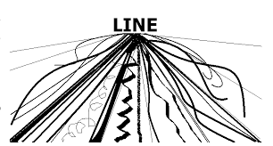
1. Line: Is used in art in many different ways like the lines could be dotted, curved, skinny, thick, horizontal, vertical, or diagonal.
2. Mass: Is a solid body that is made of many different elements like colour, line, value, and texture. This makes it look like it has volume.
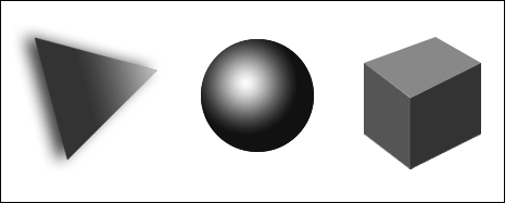
3. Shape: Is taking lines to make them enclose them to make a triangle, square, or circle are just some examples of shapes they can make.
4. Texture: Is to make things look bumpy, soft, shiny, rough, and smooth.
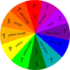
5. Colour: Is what the eye visually sees and connects to strong emotions.
6. Value: is the light or dark colours of your object or your objects shadow.
1. Line: Is used in art in many different ways like the lines could be dotted, curved, skinny, thick, horizontal, vertical, or diagonal.
2. Mass: Is a solid body that is made of many different elements like colour, line, value, and texture. This makes it look like it has volume.
3. Shape: Is taking lines to make them enclose them to make a triangle, square, or circle are just some examples of shapes they can make.
4. Texture: Is to make things look bumpy, soft, shiny, rough, and smooth.
5. Colour: Is what the eye visually sees and connects to strong emotions.
6. Value: is the light or dark colours of your object or your objects shadow.

Principles:
1. Balance: Is the balance of colours, textures, and/or shapes. It should make your thing feel stable.
2.Unity/Proximity: Unity is to make it look like it’s all together or as it is one thing. Proximity is making sure you have enough space in between each item.
3.Alignment: is where everything is level or on one side.
4.Repetition: is have more than one of than item.
5.Contrast/Consistency: Contrast is having small and lager, colorful and dark, and rough and smooth objects. Consistency is describing all elements in one thing.
6.White space: Is the space between the other elements and principles so it gives eyes breathing space between each image.
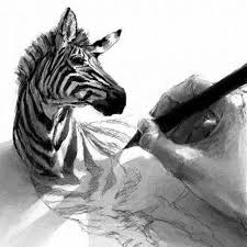
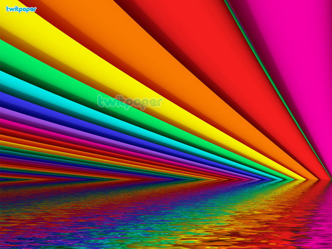
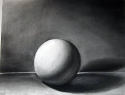
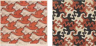
Image one: It uses these elements and principles because it creates the effect of it popping of the page. Each element and principle, white space, Balance, Value, and Texture.
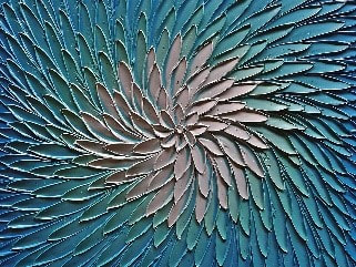
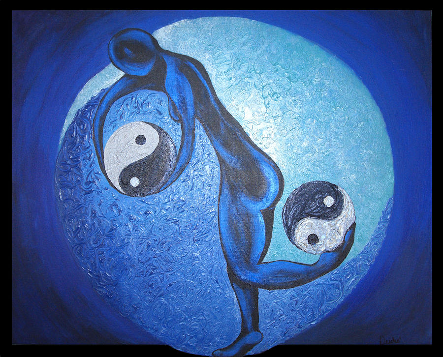
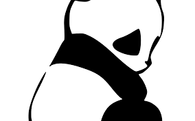
Image two: It uses the colour, texture, and contrast come to be one. White space makes it pop.
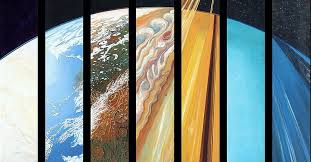
Image three: The texture makes the water look rippled. The colours and line create the repetition and alignment.
Image two: It uses the colour, texture, and contrast come to be one. White space makes it pop.
Image three: The texture makes the water look rippled. The colours and line create the repetition and alignment.
I got all of the images off of google. I can't remember what i searched to get the images.
