Annika Schmidt
Menu
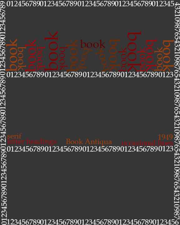
They are in the fonts, the colours I choose for the words, and the way I made the words/ if they are horizontal or vertical.
I chose the fonts because more me I feels like the words I used.
The fonts make them look upper and lower case, also I just did not thing about it.
The colours I used is, to me, what they look or feel like.
I just left it white, so the words pop out.
Home
About Me
Gallery
Inspiration
Elements and Principles of Design
Texture
Line
Mass
Shape
Value
Colour
Photography
Home
About Me
Gallery
Inspiration
Elements and Principles of Design
Texture
Line
Mass
Shape
Value
Colour
Photography